
The death cross is one of the most widely recognized patterns in technical analysis, yet it remains one of the least well understood. Its reputation often gets ahead of its meaning. Many investors first encounter it through dramatic headlines or alarmist commentary, while few pause to understand what the signal is actually saying.
At its core, the death cross is not a forecast. It does not predict crashes or provide buy or sell instructions. Instead, it reflects a trend shift that has already occurred, based on how short-term price momentum has deteriorated relative to the long-term trend.
As of January 2026, this pattern is appearing across a broad range of large-cap stocks, spanning technology, financials, consumer names, utilities, and real estate. In total, 13 companies with market capitalizations above $50 billion are currently trading under a confirmed death cross. That breadth makes the signal especially relevant, not as a reason for panic, but as a real-world opportunity to study how it behaves across sectors and market environments.
This article breaks down the death cross clearly and practically. It explains how the signal works, how it compares to the golden cross, and how professional investors incorporate it into a broader framework of trend analysis. Using current examples from January 2026, including Oracle and Uber, we will examine what the death cross tends to indicate, how it forms, and just as importantly, what it does not.
Key Takeaways on Death Cross Stocks
- The death cross is a trend signal, not a prediction. It reflects weakness that has already developed rather than forecasting what comes next.
- Context determines its importance. The same pattern can signal sustained downside in one stock and temporary consolidation in another, depending on trend, volume, and market conditions.
- Broad occurrence matters more than headlines. With 13 large-cap stocks showing a death cross in January 2026, the signal offers insight into market rotation across sectors rather than isolated company risk.
What Is a Death Cross and How Does It Form?
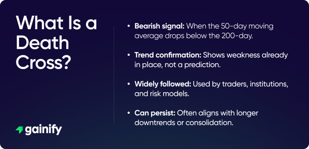
A death cross occurs when a stock’s 50-day moving average falls below its 200-day moving average. These two averages represent different views of price behavior. The 50-day reflects recent momentum and short-term trading activity, while the 200-day tracks the long-term trend that many institutional and long-only investors use as a benchmark.
When the shorter-term average drops below the longer-term one, it signals that weakness has persisted long enough to weigh on the broader trend. This is not a sudden or forward-looking event. It is the result of sustained underperformance over time becoming visible on the chart.
That distinction is critical. A death cross does not predict a crash, nor does it signal that a stock must continue falling. It simply confirms that the trend has already weakened. Used correctly, the death cross helps investors understand market conditions and adjust expectations, rather than react emotionally or make rushed decisions.
Why the Death Cross Is a Lagging Signal by Design
The death cross is built entirely from past price data. Moving averages do not anticipate price moves, they respond to them. As a result, every death cross appears only after a stock has already weakened. In most cases, a meaningful portion of the decline has already taken place by the time the signal shows up on a chart.
This is where many investors go wrong. Reacting to the signal itself often leads to selling late, when downside momentum is already well underway. The more important warning usually appeared earlier, when price first broke support, failed to make new highs, or began forming a pattern of lower lows.
Professional investors understand this limitation. They do not treat the death cross as an instruction to act. Instead, they use it as confirmation that trend damage has already occurred and that market conditions have changed. The signal helps frame risk and expectations, not dictate immediate buy or sell decisions.
Death Cross vs Golden Cross: Understanding the Full Cycle
The death cross has a well-known counterpart: the golden cross. A golden cross occurs when the 50-day moving average rises above the 200-day moving average and is often described as bullish.
Both signals suffer from the same limitation. They are backward-looking.
A golden cross usually appears after a recovery has already begun. A death cross usually appears after a decline has already taken place. Neither tells you where price will go next. Instead, they describe whether short-term momentum is aligned with or working against the long-term trend.
Death Cross vs Golden Cross: Key Differences Explained
Feature | Death Cross | Golden Cross |
Definition | 50-day moving average falls below the 200-day | 50-day moving average rises above the 200-day |
What it reflects | Trend deterioration already in place | Trend improvement already underway |
Timing | Lagging signal, appears after a decline | Lagging signal, appears after a recovery |
Typical market context | Weakening momentum, rising risk | Strengthening momentum, improving conditions |
Common investor reaction | Fear, caution, reduced exposure | Optimism, increased confidence |
Predictive power | Does not predict future declines | Does not predict future gains |
Best use | Risk management and trend awareness | Trend confirmation and position validation |
Most effective when | 200-day average is falling | 200-day average is rising |
Biggest mistake | Treating it as a sell signal | Treating it as a buy signal |
Why Death Crosses Still Matter in 2026
Even though the death cross is a lagging signal, it remains relevant because markets are driven as much by behavior as by fundamentals. Many institutional investors, systematic funds, and risk models track the same trend indicators. When a death cross appears, it often triggers subtle but important shifts in behavior, including reduced exposure, tighter risk controls, and a more defensive posture across portfolios.
More importantly, the death cross often aligns with a broader change in market regime. In healthy trends, prices trade above a rising 200-day moving average and pullbacks are typically met with buying interest. In weaker environments, prices fall below a declining 200-day average and rallies are more likely to be sold. The death cross frequently appears near this transition point, making it a useful signal for recognizing when the market’s underlying dynamics have shifted and when patience and caution tend to matter more than aggressive positioning.
Why Not All Death Cross Stocks Are the Same
One of the most common mistakes investors make is treating every death cross as identical. The signal only has meaning when it is interpreted in context, and without that context it can easily become misleading.
In some cases, the death cross confirms a clear breakdown. Price is already trading below the 200-day moving average, rallies fail quickly, and selling pressure remains persistent. In other situations, the signal appears during sideways or choppy markets, where moving averages cross frequently with little follow-through. There are also cases where the death cross forms late in a decline, after much of the downside has already occurred.
This is why experienced investors never focus on the crossover alone. They evaluate the full technical picture, including price structure, behavior around key support levels, volume patterns, and the slope of the 200-day moving average. These factors determine whether a death cross is a meaningful trend signal or simply background noise.
Large-Cap Death Cross Stocks ($50B+) as of January 2026
Below is a current list of large-cap stocks that have recently triggered a death cross as of January 2026. This list spans multiple sectors, showing that the signal is not isolated to one industry.
- Arm Holdings (NASDAQ: ARM)
- Coinbase Global (NASDAQ: COIN)
- DoorDash (NASDAQ: DASH)
- Duke Energy (NYSE: DUK)
- Ecolab (NYSE: ECL)
- HDFC Bank ADR (NSEI: HDB)
- Realty Income (NYSE: O)
- Oracle (NYSE: ORCL)
- O’Reilly Automotive (NASDAQ: ORLY)
- Roblox (NYSE: RBLX)
- Trane Technologies (NYSE: TT)
- Uber Technologies (NYSE: UBER)
- Vistra Corp (NYSE: VST)
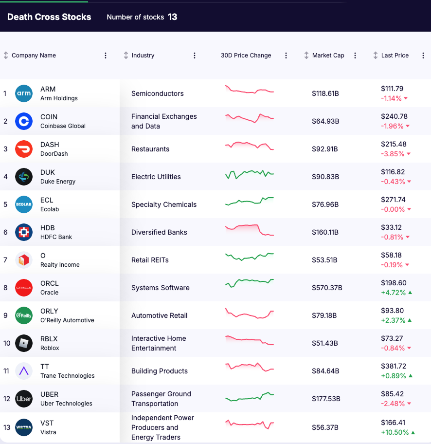
This diversity highlights an important point. Death crosses often emerge during broader market rotations rather than isolated company-specific events.
Case Studies: Oracle and Uber (January 2026)
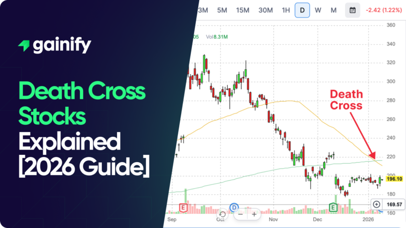
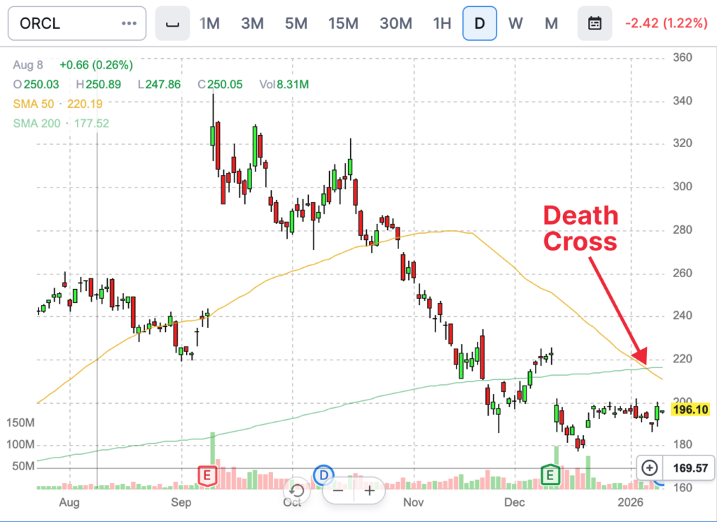
Oracle (ORCL) – Death Cross on January 7, 2026
Oracle’s death cross appeared after a sustained decline from its highs. Price had already broken below key support levels, and the 200-day moving average had flattened. In this case, the signal confirmed trend deterioration rather than predicting new downside. The key focus now is whether Oracle can reclaim the 200-day average or continues to fail below it.
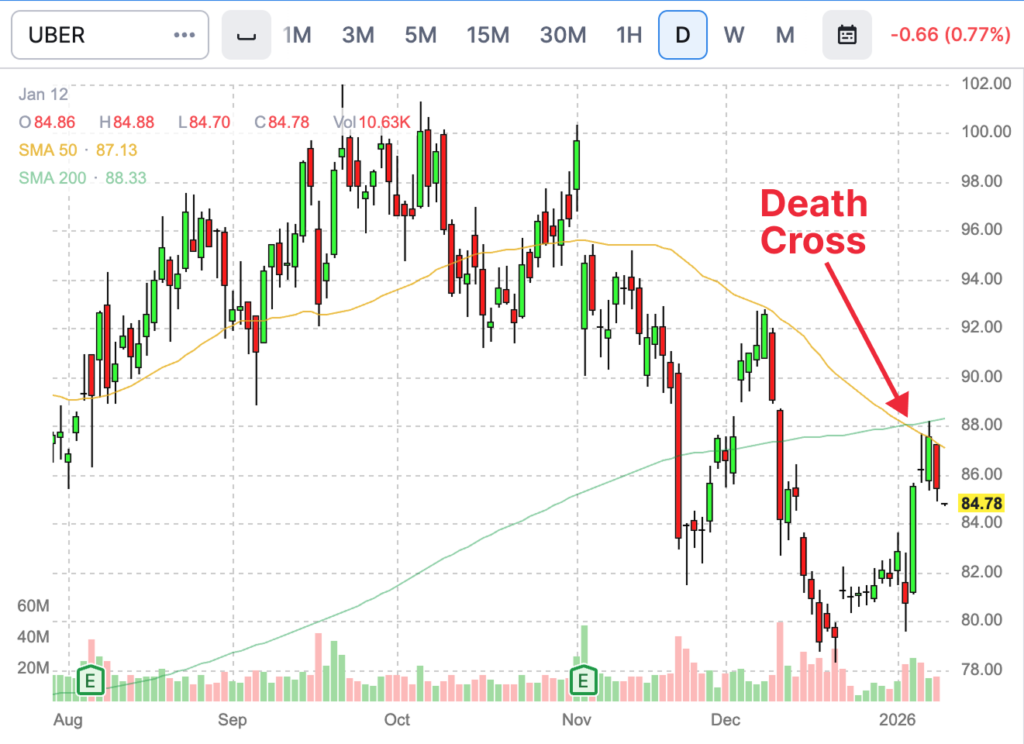
Uber (UBER) – Death Cross on January 5, 2026
Uber’s crossover occurred in a more volatile environment. The 200-day average was still rising, and price volatility pulled the 50-day lower quickly. This type of death cross often reflects consolidation or temporary weakness rather than a structural breakdown. Follow-through matters far more than the signal itself.
These two examples show why context is everything.
How Long-Term Investors Should Interpret Death Cross Stocks
For long-term investors, a death cross is rarely a reason to sell on its own. Instead, it serves as a risk management checkpoint. It encourages a thoughtful review of position size, a reassessment of underlying fundamentals, and restraint around adding new capital until price behavior and trend structure improve.
Importantly, many high-quality companies experience death crosses during broader market corrections or periods of sector rotation and later recover. The signal does not invalidate a business model or long-term thesis. It simply indicates that market conditions have shifted and that patience is often more valuable than immediate action.
Limitations of Using Death Crosses in Stock Analysis
While the death cross is a widely followed technical signal, it has important limitations that investors need to understand. The most significant is that it is a lagging indicator. Because it is based on moving averages, the signal appears only after a stock has already experienced a period of weakness. By the time the death cross forms, much of the price decline may already be behind it.
Another limitation is the risk of false signals, especially in sideways or highly volatile markets. When prices move within a broad range, moving averages can cross frequently without leading to a sustained trend. In these conditions, death crosses may offer little useful information and can result in unnecessary trading if acted on in isolation.
The death cross also provides no insight into magnitude or duration. It does not indicate how far a stock might fall or how long weakness may last. Without confirmation from other indicators such as volume, support levels, or broader market trends, the signal lacks context.
For these reasons, professional investors rarely rely on the death cross alone. It is most effective when used alongside other forms of analysis, including price structure, trend strength, and fundamental considerations.
How to Identify a Death Cross on a Stock Chart
Identifying a death cross on a stock chart is straightforward and does not require advanced tools. Start by applying a 50-day moving average and a 200-day moving average to the price chart. These are standard indicators available on most charting platforms.
A death cross occurs at the point where the 50-day moving average crosses below the 200-day moving average. The crossover itself is typically easy to spot, as the shorter-term line visibly moves under the longer-term one.
However, identification should go beyond the crossover alone. It is important to observe where price is trading relative to both moving averages, whether the 200-day average is rising, flat, or falling, and how price behaves immediately after the cross. Weak follow-through or quick recoveries often reduce the signal’s significance, while sustained trading below a declining 200-day average tends to reinforce it.
Using these additional observations helps ensure the death cross is interpreted correctly and placed in proper market context rather than treated as a standalone event.
Final Thoughts: What Death Cross Stocks Really Tell Investors
The death cross is not a forecast of disaster. It is a confirmation that momentum has weakened and that the market environment has changed. The signal reflects what has already occurred in price, not what must happen next.
Used incorrectly, it can lead to emotional decisions and poorly timed exits. Used correctly, it reinforces discipline, improves risk awareness, and helps investors align their actions with prevailing trends rather than fight them.
In 2026, the real edge is not recognizing a death cross on a chart. It is understanding when it matters, when it does not, and what signals to watch after it appears.
Disclaimer
This article is for informational and educational purposes only and does not constitute investment advice. Investing involves risk, including the potential loss of principal. Readers should conduct their own research or consult a licensed financial advisor before making any investment decisions.